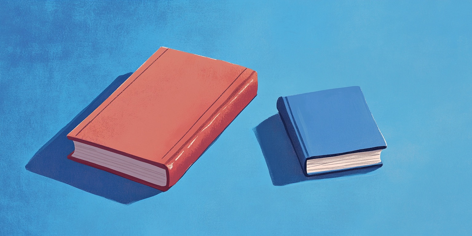


Did you know that the format you use has an impact on the way any given reader might perceive your book? In fact, book formatting can completely make or break your reader's experience.
If the book font guide from The Book Designer is any indication, there is so much you can learn just about typography!
Fonts like Webdings or Comic Sans have been extensively memed about, but it goes beyond that. A study done by Wichita State University’s Software Usability Research Laboratory shows that people actually respond differently to different fonts: script fonts were perceived as feminine, serif fonts as practical, and modern fonts as masculine.
As writers, we spend a ton of time thinking about how readers will respond to our story, characters, themes, and prose. But it’s also important to factor in how readers will respond to our book as a finished product, complete with a book cover design and pages.
The way the words look on those pages matters, too.
In this article, we’re going to talk all about book formatting. We’ll talk about what book formatting is, whether you should format a book, and 11 simple tips for how to format a book yourself.
What is book formatting?
Book formatting is the way your book looks. It’s the layout of your book. Think chapters, page numbers, paragraph spacing, things like that. This includes aesthetic choices like which fonts you use for chapter headings and page numbers, and it also includes more technical choices like line spacing and font size.
There are different pre-existing formats used for different purposes.
For example, if you went to public school, you’re probably familiar with MLA, APA, and Chicago-style formats. Even if you haven’t actually used them, you’ve likely heard about them. These are formats used for essays, and they dictate the way a paper is structured, how sources are cited within the paper, and how the bibliography looks.
Why do we use formats like this? Mainly, it helps with consistency.
Using one format for your entire essay makes it much more readable. The reader knows automatically what your cited sources look like and how to read your writing.
Books follow the same principles.
Using consistent book formatting keeps the content organized, and it helps the reader to follow along easily. Strange or inconsistent book formatting might pull your reader out of the story. They will wonder why the font is suddenly bigger, why the spacing is suddenly strange, or what exactly is up with your footnotes.
Can anyone format a book?
So, can just anyone format a book? In other words… can you format a book?
Well, yes and no. Book formatting is a skill like any other. There’s some stuff you need to learn and some tools you’ll need to use.
Formatting a book to print takes a lot of time and effort, and it’s a lot more complicated than it may initially seem. If you’ve never done it before and you’re planning to try book formatting yourself, you’ll need to allow a healthy amount of time to learn how it works.
That being said, you can absolutely learn to do it. It’s possible on programs like Word and Google Docs (although it’s arguably most difficult to do it this way), and there are also a ton of book formatting software options out there to help you (we'll talk more about those later).
But how DO you format a book? Let's discuss our top tips for stellar book formatting.
11 tips for proper book formatting
Figuring out how to format a book for print will vary widely based on which software you’re using and what sort of book you’re formatting.
For example, a picture-heavy coffee table book with huge pages will be a different animal than your standard novel.
A comic book will look different than an adult biography.
This means that when it comes time to format your book to print, you’ll need to research the specific software you’re using and the specific book you want to create.
If you’re determined to use Microsoft Word and you want to make a paperback that’s about five by eight inches, you’ll have to find resources that meet those specific parameters.
However, there are some tips and tricks you can learn right now to help you make your manuscript cleaner. This set of guidelines will be perfect for polishing up a manuscript to send to an editor or to a cover artist, and it’ll make it much easier for you to put your book into a book formatting software.
Think of these as industry standard guidelines.
Oh, and these tips don’t require you to purchase any formatting software—you can do all of this in Google Docs, Microsoft Word, or whatever you’ve got on hand!
Use headers to create chapters
Okay, so, quick confession: I didn’t know about using headers in Microsoft Word until about a year ago. I’d been freelancing for a while, so I knew about Google Docs, but I always did my creative writing in Microsoft Word, and I didn’t use headers. This meant that my seventy-thousand-and-up word manuscripts had no real structure. I hit Enter, I wrote “Chapter Seven,” and I kept going.
This is no way to live, it turns out.
Adding headers in Microsoft Word works almost exactly the same as it does in Google Docs. Go to the ribbon and look on the right-hand side—you’ll see a column with different options like ‘Normal,’ ‘Heading 1,’ ‘Heading 2,’ and so on. Use these to sort your manuscript into chapters.
You can also use headings and subheadings to separate your book into parts and then chapters, if applicable.
This makes it much easier to find specific chapters and scenes in your book, and it will make a world of difference when it comes time to put your book into whichever book formatting software you use.
Check your line spacing
Paragraph and line spacing should be consistent throughout your manuscript. The general rule of thumb is to use an indentation at the beginning and to have no space in between different paragraphs. In Microsoft Word and Google Docs, you can set the entire manuscript to include or exclude spaces between paragraphs.
You may also choose to put a space between paragraphs. This is common in nonfiction manuscripts. If you do, don’t include the indent at the beginning, and make sure the spacing is consistent. Use your word processing software to set the spacing automatically to keep it uniform.
Choose a readable font
You want your book to be written in a font that is easy on the eyes. And yes, I mean that BOTH ways. It should be attractive and it shouldn't cause eye strain.
Some fonts to consider are Garamond, Janson, Caslon, or Minion. They have been used in many, many books.
If you aren't sure what font to use yet, put your manuscript into Times New Roman 12 pt font. I’m not saying you have to draft in Times New Roman, and I’m not saying you have to publish in Times New Roman—if you fall in love with Garamond, live your best life.
But when you format your book, you can start here, because Times New Roman is basically the standard font. It’s readable, and it’s accepted by just about everybody, editors and agents alike.
Select your font size
Once you have your font, you need to choose a font size. You want it to be easy to read, but not SO easy that it ends up being a "large font edition."
The majority of books are written in 11-point type, but that’s not a hard-and-fast rule. It might depend on the font you have chosen. You should aim for about 10–15 words per line in your chosen font.
Give your margins some cushion
The margins are the white spaces around the body text.
How big should book margins be?
For a 5" x 8" inch book, a 5/8” margin would be perfect. For a 6" x 9" book you should shoot for a 3/4” margin. You may also need to make the inside margins slightly bigger to account for bookbinding.
A roomy margin makes your book more comfortable and inviting to read.
Use black text on a white background
This might sound obvious, but it’s important: you want to use black text on a white background. This is the most readable option, it’s the easiest to print, and it’s industry standard.
I personally like to change my page and text color when I’m drafting to make it easier on my eyes—in Microsoft Word, I change the page color to black and type in white for a DIY ‘dark mode,’ and Novelpad (which I’ll talk about later) comes with a dark mode that you can just turn on.
These are great tips for drafting, but you’ll want to put the document back to a white page with black text when you’re all done.
Number your pages
Numbering your pages makes it much, much, much easier to find specific scenes and reference specific lines. Make sure your page font is the same as your body text font—again, it should all be in Times New Roman. You’ll also want to use the page number tool on whichever word-processing software you use.
Check spacing after periods
I know this sounds super particular, but guess what? Book formatting is all in the little details, and this one is no exception.
There should be one space after periods, not two. This is probably the default for your processing software, but give your manuscript a once-over to double-check.
Make sure your story is justified
When you “justify” a paragraph in typography, it means to set your text so it runs right up against the left and right-hand margin. This makes a beautiful, even rectangle in the middle of your page.
All word processors have this option. Most professionally formatted books are justified. Just take a look at some of your own books if you don't believe me!
Mark scene breaks
Whether you are writing a nonfiction book or a fiction one, you will probably shift focus at some point in one of your chapters. You could be switching between characters, denoting a time jump, or marking the end of an anecdote. The easiest way to indicate this is with a line break. The standard line break is just that, a line. You can play with the length and thickness.
Of course, you can come up with creative line breaks, too. Such as using an asterisk.
****
You could also have a designer create a custom line break for you that matches the theme or feel of your story.
Choose the right page size
Before you send your manuscript to your line editor, you need to check your book’s page size. Word processors almost always default to 8.5x11” pages, which is the standard you should use—this means that as long as you didn’t change your pages at some point, it’s probably already correct. Just do a quick double-check to make sure you didn’t accidentally change it.
Of course, if you are creating a coffee-table book, or some other non-standard book size, you will want to adjust your page size to suit your intended product.
Now that you have all the book formatting tips you need, let's talk about our favorite book formatting software.
The best book formatting software
After you've followed the steps above, your manuscript is now fit to send to an editor, agent, or professional formatter. But what if you’re the do-it-yourself type?
Luckily, we have a full guide to the best book formatting software available. But let's talk quickly about a few of my favorite options.
- Kindle Create: Ideal for self-publishing on Amazon, Kindle Create offers a user-friendly interface and seamless integration with Amazon KDP, ensuring a smooth transition from manuscript to Kindle eBook format. Its intuitive interface helps you import your manuscript, apply professional themes, and preview how your book will appear on various Kindle devices.
- Reedsy Book Editor: A fully web-based platform, Reedsy Book Editor stands out for its clean design and collaborative capabilities. Authors can write, format, and export print-ready or eBook files directly within the tool. Additionally, its integration with the Reedsy marketplace makes it easy to connect with vetted editors, designers, and other publishing professionals, turning the platform into an all-in-one ecosystem for both book creation and professional refinement.
- Atticus: Atticus is celebrated for being an all-purpose writing and formatting tool accessible on nearly any device. With its emphasis on simplicity, it enables authors to craft clean, elegant layouts for both print and digital formats. Features like drag-and-drop chapter organization, built-in theme customization, and distraction-free writing mode make Atticus a strong choice for authors who want versatility without a steep learning curve.
- Vellum: Often considered the gold standard for indie authors, Vellum is known for producing exceptionally polished eBooks and print interiors. Its Mac-exclusive interface is visually appealing and incredibly easy to navigate, allowing users to preview their book in real time and apply high-quality templates with minimal effort. Vellum’s professional output and reliable style consistency make it especially popular among authors who want standout design without hiring a layout artist.
- Scrivener: More than just a formatting tool, Scrivener is a robust writing environment built for long-form projects. It excels at helping authors organize complex manuscripts through folders, notecards, outlines, and research panes. While its formatting tools are not as design-focused as Vellum or InDesign, Scrivener offers flexible exporting options that allow writers to compile their manuscripts into a variety of formats (eBooks, manuscripts, or print-ready files), making it a powerful all-in-one solution for planning, drafting, and preparing your book.
- NovelPad: Created specifically for fiction writers, NovelPad combines structured writing tools with simple project organization. It supports scene-based plotting, note tracking, character sheets, and chapter rearranging through an intuitive drag-and-drop interface. When it comes to formatting, NovelPad offers straightforward export options that make manuscript preparation easy, especially for novelists who want a minimal, distraction-free environment focused on story craft.
- Adobe InDesign: A flagship in professional publishing, Adobe InDesign offers unmatched control over layout, typography, spacing, and visual elements. It’s the industry standard for producing intricate print designs, from novels and illustrated books to workbooks and magazines. While its advanced tools come with a steeper learning curve, InDesign is the best choice for authors or designers seeking maximum creative freedom and precision, particularly for visually complex books.
- Blurb BookWright: Designed with self-publishers in mind, Blurb BookWright provides a user-friendly layout environment paired with a rich library of templates. Authors can create anything from photo books to novels and export both print and eBook versions. Its deep integration with the Blurb platform enables direct printing and distribution options, making it a convenient solution for authors who want a straightforward path from design to professionally produced print copies.
Don’t want to tackle book formatting by yourself?
Would you rather pay a professional to do your book formatting for you?
Frankly, I don't blame you. Learning how to write a book is the fun part for me, but everything else I would rather wash my hands of!
If you want some help with formatting your latest book, The Book Designer is a wonderful option. But our team at selfpublishing.com can also help! We can assist you not only with formatting, but with any part of the book writing and self-publishing process.
If you would like to learn how to publish the next bestseller, you can schedule a free strategy call with our team today.